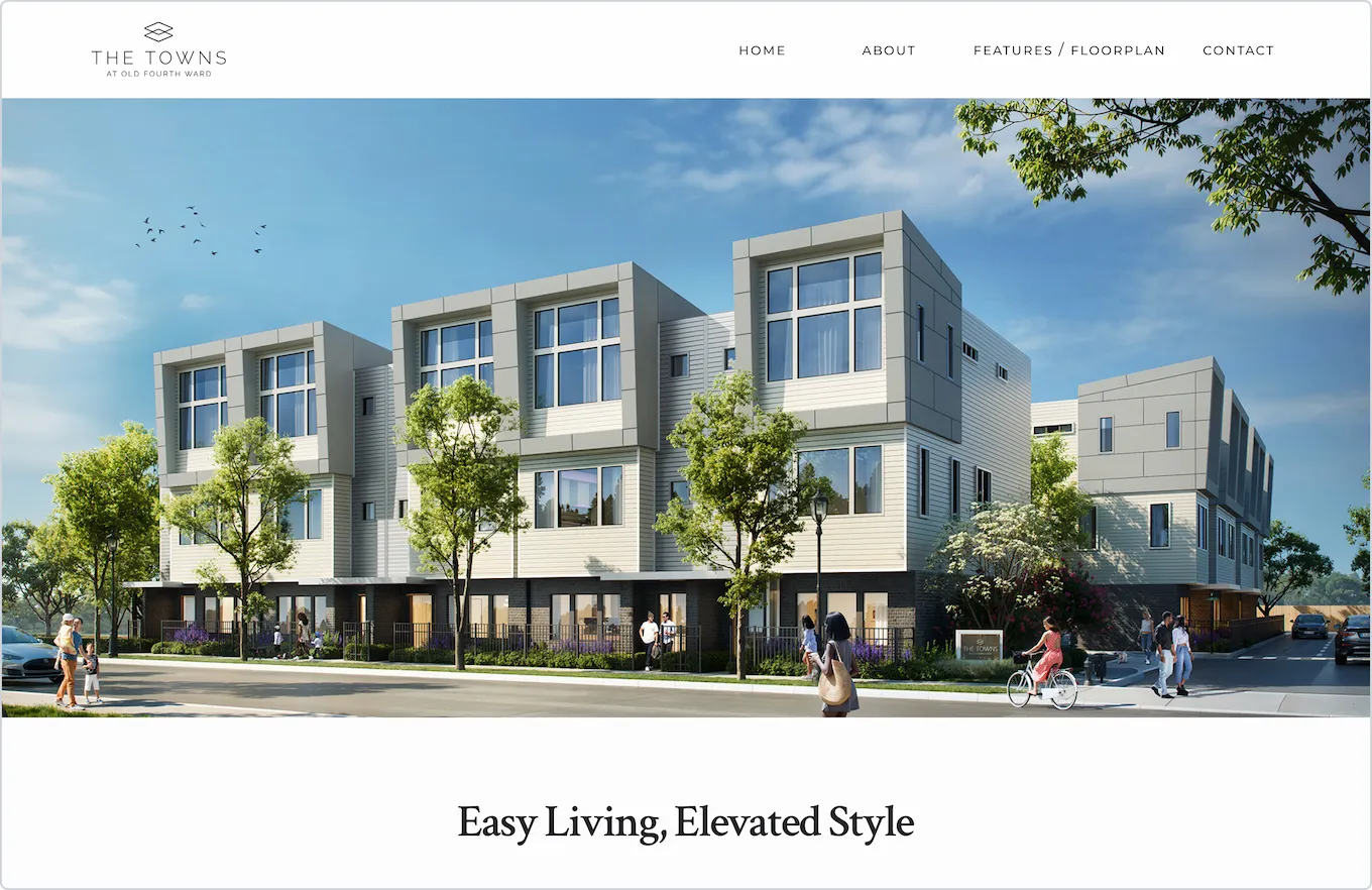
Overview
A developer in Atlanta needed a site before their 31-unit townhome community went to market. They had everything: brand direction, photography, floor plans, copy, a reference site. What they needed was someone who could take all of it and build something that stopped a buyer mid-scroll.
I came by referral. The contact knew me not as a developer, but as an apparel designer, business owner, and someone with years in sales and marketing. The brief was simple: we trust your eye, build us something good. This was my first fully coded website.
The goal: A clean, fast site that takes a buyer from first look to form submission — before the community opens.
The Challenge
The site had one job: make someone — standing in a sales office or scrolling at 11pm — feel like they already live there.
The photography was beautiful but heavy. Four floor plans needed to be browsable without cluttering the page. And the whole thing had to work on mobile — where most real estate browsing happens — without feeling like an afterthought.
Key requirements
- Mobile-first design for buyers browsing on phones
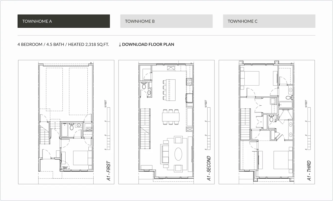
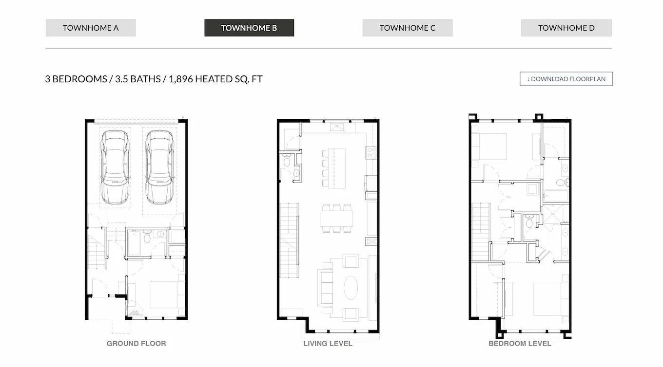
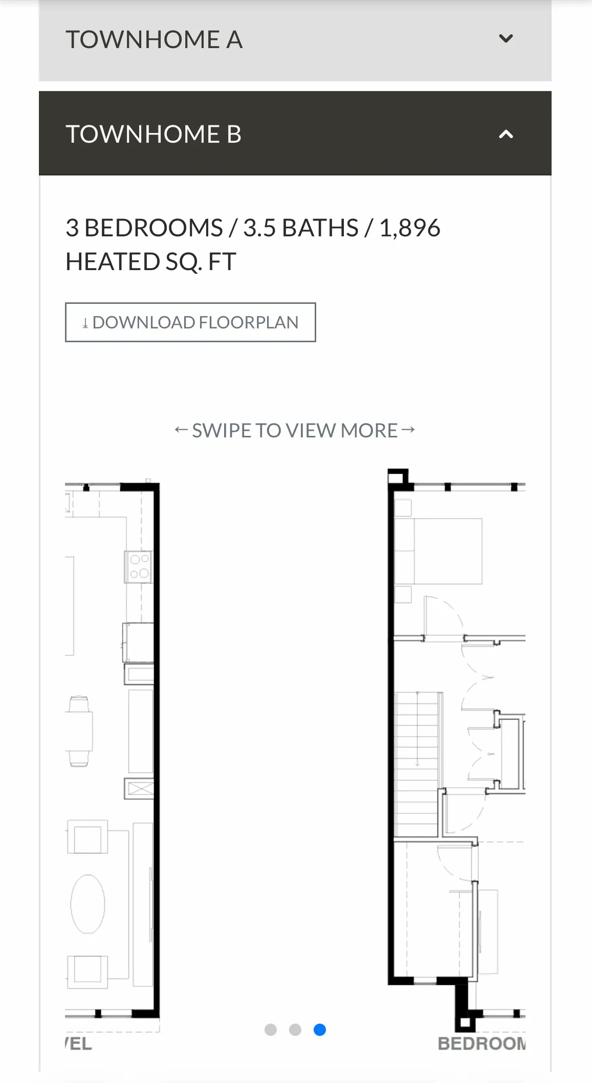
- Floor plan viewer supporting four distinct plans, each with three levels of imagery and a downloadable PDF
- Integrated lead capture wired to the listing agent's inbox with zero back-end infrastructure
- Image optimization to keep load times low despite large-format property photography
- Clean, minimal aesthetic that felt elevated without feeling cold
Approach
I started with the client's reference site and stripped it to its bones: what does a buyer need, and in what order? The answer shaped everything — impression, features, floor plans, neighborhood, contact. Before writing a line of code, I built a Figma prototype for the client to approve.
For the build, I used Bootstrap with custom CSS. It was my first project — Bootstrap gave me a solid structure to work from while I focused on the design.
The most interesting problem was the floor plan section.
The floor plan interaction
Four plans. Three levels each. The challenge was making twelve floor plan images browsable without burying the page.
Plans sit under an accordion — one open at a time, defaulting to Plan A on load. Within each plan, the three
floor levels are navigable via a horizontally scrollable container: CSS overflow-x,
scroll-snap-type, and scroll-snap-align. Each level snaps into place as the user
swipes. No JavaScript needed.
The page stays clean. Buyers get the full picture without the scroll fatigue.
What I built
- Page structure organized around buyer decision stages: impression → features → floor plans → neighborhood → contact
- Netlify Image CDN for automatic WebP/AVIF conversion on all property photography
- Accordion floor plan viewer with CSS scroll-snap navigation between floor levels — no interaction library
- Netlify Forms for zero-backend lead capture, wired directly to the listing agent
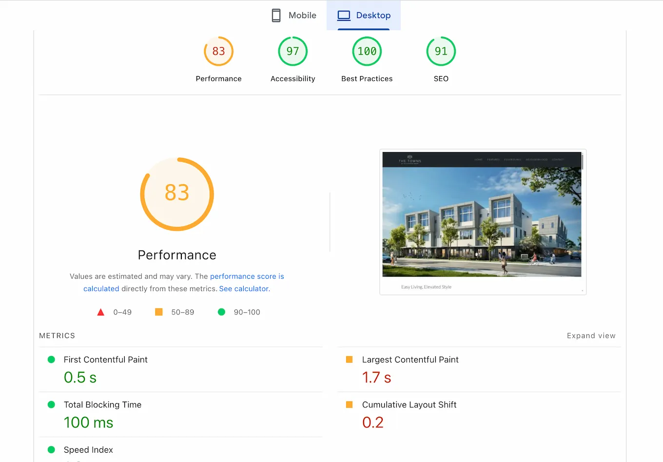
Results
The site launched and the client has been using it since. Leads are coming in through the Netlify dashboard. The form works.
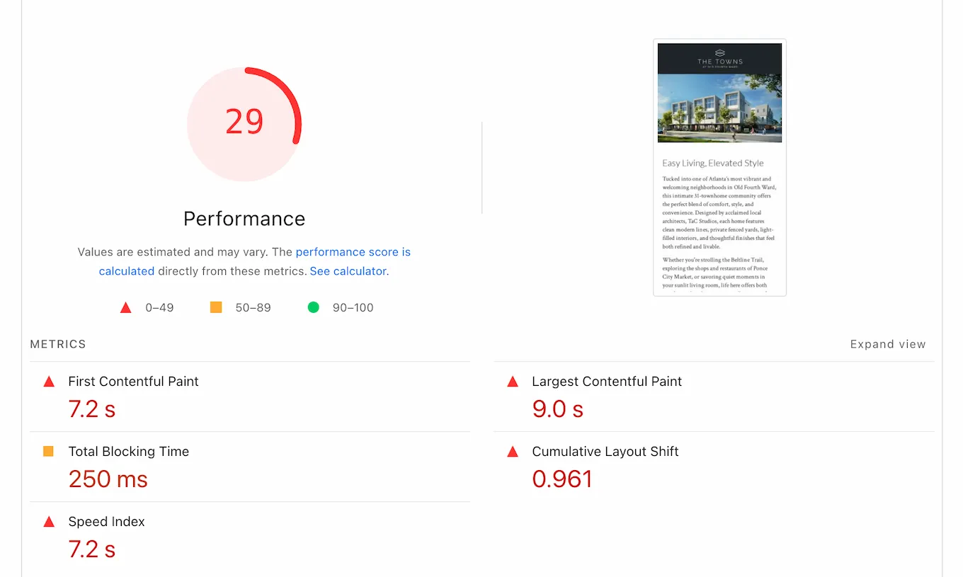
Desktop Lighthouse scores reflect a clean build. Mobile tells a different story — and it's worth understanding why.
The numbers: LCP 9.0s, FCP 7.2s, CLS 0.961 — nearly ten times the threshold for "poor." Images without defined dimensions made the layout jump as they loaded. Bootstrap's render-blocking resources pushed paint times out further. The site works. On mobile, it makes users wait.
Reflection
The performance issues point directly to the tool I chose. Bootstrap made sense at the time — it was my first project, and the structure let me focus on design. But it loads a full CSS and JavaScript bundle whether you need most of it or not. For a site this simple, that's dead weight. On mobile, dead weight shows up as seconds.
The CLS problem is separate: images without explicit width and height give the
browser nothing to reserve, so the layout shifts as they load. Fixable — but it still needs doing.
If I built this today, I'd do it the way I built my portfolio — vanilla HTML, CSS custom properties, just enough JavaScript. No framework. Full control. The lesson wasn't theoretical. I applied it on the next project.